When I first moved to Chicago, I was excited about being able to go to as many of the CSO’s concerts as I could afford. However, when I looked over the season brochure I instantly let loose my usual complaint: not enough contemporary music. Then I paused. “Wait a minute. Is this unfounded? Is my bias creating a misinterpretation?” The concert schedule certainly seems to suggest that my suspicions were correct, but I decided a more rigorous investigation was required. And so, I began collecting data.
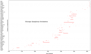
I wrote down every composition featured during the orchestra’s season and found the range of years that each piece was composed. On the left, the composers of all the pieces are arranged from oldest to youngest by birth year. The x-axis are the actual years that the pieces were composed, including revisions and orchestrations by the composer. The plot isn’t a particularly useful graphic, it just looks pretty. When there are a lot of lines overlapping in a vertical column that means more pieces from that time period. Here we see a lot of activity in the 1880-1915 area, and 1930-1955. But look at the top right. These are pieces composed in the last few years, some of them commissions to be premiered by the orchestra this season. That is wonderful news, of course, for fans of new music. However—and not to be a spoil sport, but hear me out—look right before it. It’s great that new music is being commissioned and performed, but what happened to everything from 1 year, 5 years, 10 years before? 1960-2000 is a barren land, devoid of performed music.
This graph can be compressed vertically to produce a single timeline showing all of the years covered by the compositions this season.
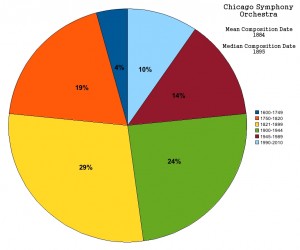
Now you can really see where the holes are. 1961-1982 is just gone, and it’s sparsely covered thereafter. I love this graph because it creates a sort of DNA fingerprint of the orchestra’s season. Even more useful than this would be to bin the compositions into periods of time and see some hard numbers. So for that, I made this:
Historic periods in music, like all periods of art, really, are poorly delineated. The periods I am attempting to represent here are Baroque, Classic, Romantic, Modern, Post-War/Contemporary. I have made a specific bin for the last 20 years of music, separate from the rest of the post-WWI music. A graph like this has the effect of making the data less finely grained. While we know that almost all of the music in the last two decades is in reality just the last two years, here it takes up a sizable 10% of the pie. Still that’s only 10%, and even with the post-war bin it’s just 24%. That is to say, barely a third of the music performed this season is of the last 65 years.
This point requires some further investigation. Music is composed by composers, and so the pieces chosen for performance are directly related to their composers. I realize I’m being a bit pedantic, but I’m trying to make things very clear: composers are the key. Of all the music ever conceived, history preserves but a tiny fraction. In a way this is a practical consideration; we might as well keep the best of the best in our culture, rather than the half-goods and the nobodies. Scholarship also plays a role: whereas Beethoven and Mozart are well documented and authenticated, Josef Labor is not as much. But this is a new age in human history, when everything can be preserved electronically and distributed with minimal costs. The internet could even allow hundreds of individuals to act as a “music copyists cloud” turning the scores of forgotten gems into sets of full orchestra parts. Imagine the cost-savings for an orchestra that wouldn’t have to pay exorbitant rental fees, but instead just print and perform for free? (Of course, the attendance is really the problem, so maybe rare gems are still a hard sell.)
Back to the analysis, it’s clear that we need to peer further into each time period and see which composers are represented. That is, how much of that period is actually considered?
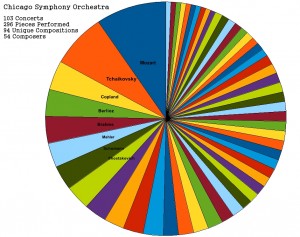
For even the most infrequent patrons of orchestra concerts, this chart should seem at least a little bit familiar. Mozart, the big M, takes up almost 10% (9.46%) of performed pieces, followed closely by Mr. T with 7.43%. Now, we must pause and consider the obvious weaknesses of this representation. The length and difficulty of a composition are completely ignored. A Mozart symphony is very much a separate beast from a Mahler symphony. This consideration should be kept in mind, but my main goal was to simply show who is being programmed. Some of the composers on the chart are easy to account for. Copland is, perhaps rather surprisingly, featured in the top 10 due to a special Copland-only concert within the orchestra’s season. Anna Clyne is the CSO’s Mead Composer in Residence, and her piece <<rewind<< will be performed five times this season. Again, something to consider but not really a problem here.
There is a sort of long-tail that emerges from the data. The left half of the pie is comprised of only 13 composers, while the right is 40! What’s going on here?
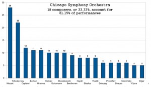
Wow. The rise of the superstar composer (posthumously). There are more than twice as many Mozart pieces programmed as Copland. More than three times more than even Beethoven! This is a skewed distribution which I feel does not do justice to the history of western music. I wouldn’t even want this skewed in the direction of a contemporary composer. There is just too much music out there to play that much of one composer. Even Tchaikovsky has more than three times as many as Debussy. In total, one third of the composers control 3/5 of the music. It’s a “sell-out”, and it’s just irresponsible.
So what gives? Is the Chicago Symphony leading the way in aging-patron-induced evasion of music from the last 50 years? Is the abundance of Mozart and Tchaikovsky compositions smothering the countless other pieces of music, preventing them from being performed?
And is this an epidemic? The Chicago Symphony Orchestra is but one of the hundreds of orchestras that perform full seasons of music every year. In fact it is one of the “Big Five” orchestras. How does it compare to another ensemble in the same class? In Part 2 I will look at the Philadelphia Orchestra, another member of the Big Five, using the same tools as here to see what their season really looks like.
Read the rest of this story by following these links:
Part 2: The Philadelphia Orchestra and The London Symphony
Part 3: The Oregon Symphony, My Conclusions, and Notes


